ios7
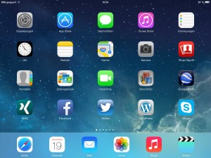
First of all I want to say I don’t like the new design of Apple’s iOS 7. It’s to colourful and reminds me to the time when I was in kindergarden. All icons of standard apps were reworked and got new signs. Now I have to look twice when I want to launch a special app e.g. system settings. Moreover Apple reworked surfaces of browser and keyboard. In my opinion I have to make it just as a habbit yet.
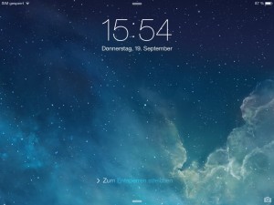
Functionality is much better. If you swipe down to up you get a quick possibility to do some system settings. Otherwise if you swipe up to down you get the daily view consists of clock and calendar. Apple focused more on its own service iCloud and I recognize more integration in this new mobile operating system.
After a 2-hours Update from iOS 6 to iOS 7 on yesterday, unfortunaly I had some problems with the keyboard. My iPad displayed letters in a 10 seconds delay after I have pressed a visual keyboard button. Resetting of all settings has solved this problem immediately.
Apple copied a lot of Android but did it on a wrong way. Functionality is quite good but design absolutly not. Looks like my learning computer „Genius“ during my time at elementary school. 😉